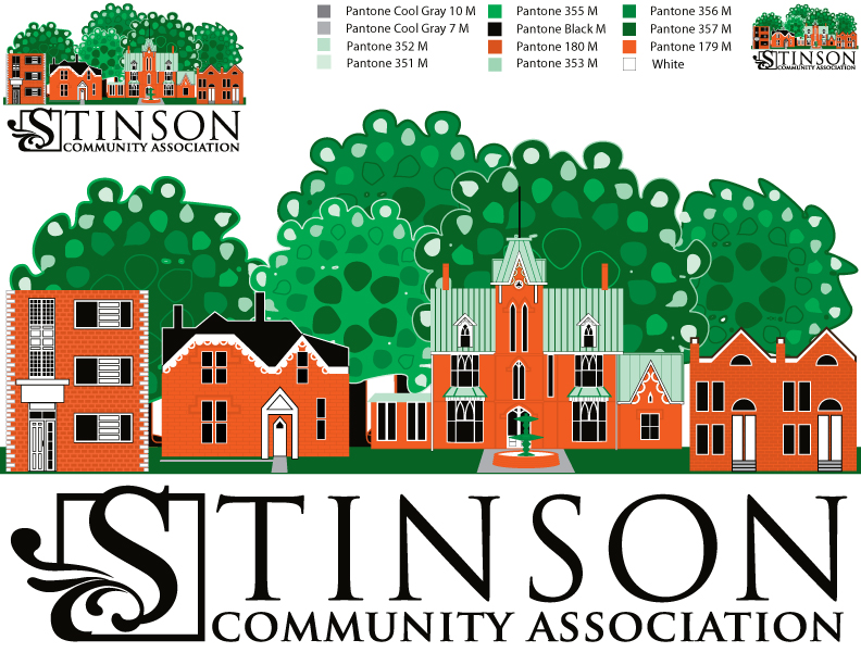
 After a review of 18 entries to our LOGO contest, we narrowed it down to 4 entries. Those 4 entries were put to a vote with comments at our April 11, 2013 General meeting. Our LOGO committee members reviewed all comments and created a composite of the final four designs. The result is a split design showcasing various Stinson architectural designs/landmarks in a streetscape caressed by the escarpment foliage. Below the streetscape is a stylized stamped “S” with our Community Association name. We can use all elements together or breakout certain details, such as the lettering, to produce letterhead, signs, banners, or novelty items. We are showing you the B&W version. Our colours are Brick, Black, and Green.
The committee also designed a new banner for our improved website which will be live on-line June 1st! Be sure to check it out.
A very special thank you to the creators of the entries upon which the composite was designed: Maggie Day-Myron, Katherine Dymkowski, and Brian Goodman.
The streetscape idea against the escarpment back-drop was based on Maggie’s design.
The wonderful team who amazingly put together all the ideas into one and recreated our website were: Ralph Meiers, Lee McIllmoyle, Dawn McIllmoyle, Mike Montreuil, and Natasha Murphy.


